
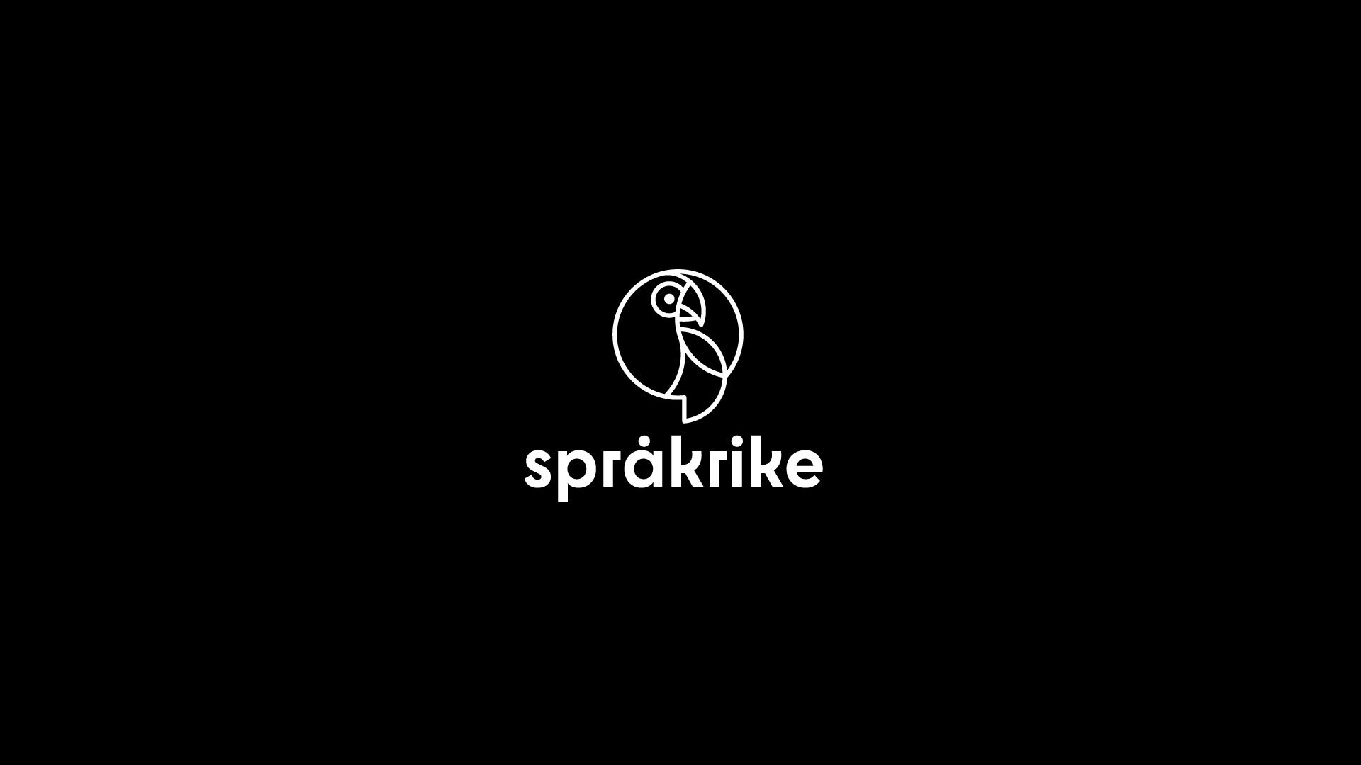
Logo and visual identity for Språkrike
Client: Friederike Gerlach / Språkrike
Role: Concept development, visual identity & graphic design
Språkrike works as a translator and interpreter, primarily for authorities and organisations. The identity needed to feel serious and trustworthy, without becoming formal or boring.
The concept balances these two sides through confident typography, a witty symbol and a playful colour palette — creating a visual identity that feels professional while reflecting the social and outward-facing nature of interpreting.


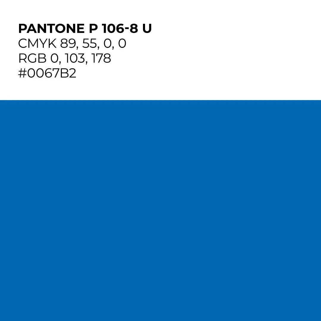

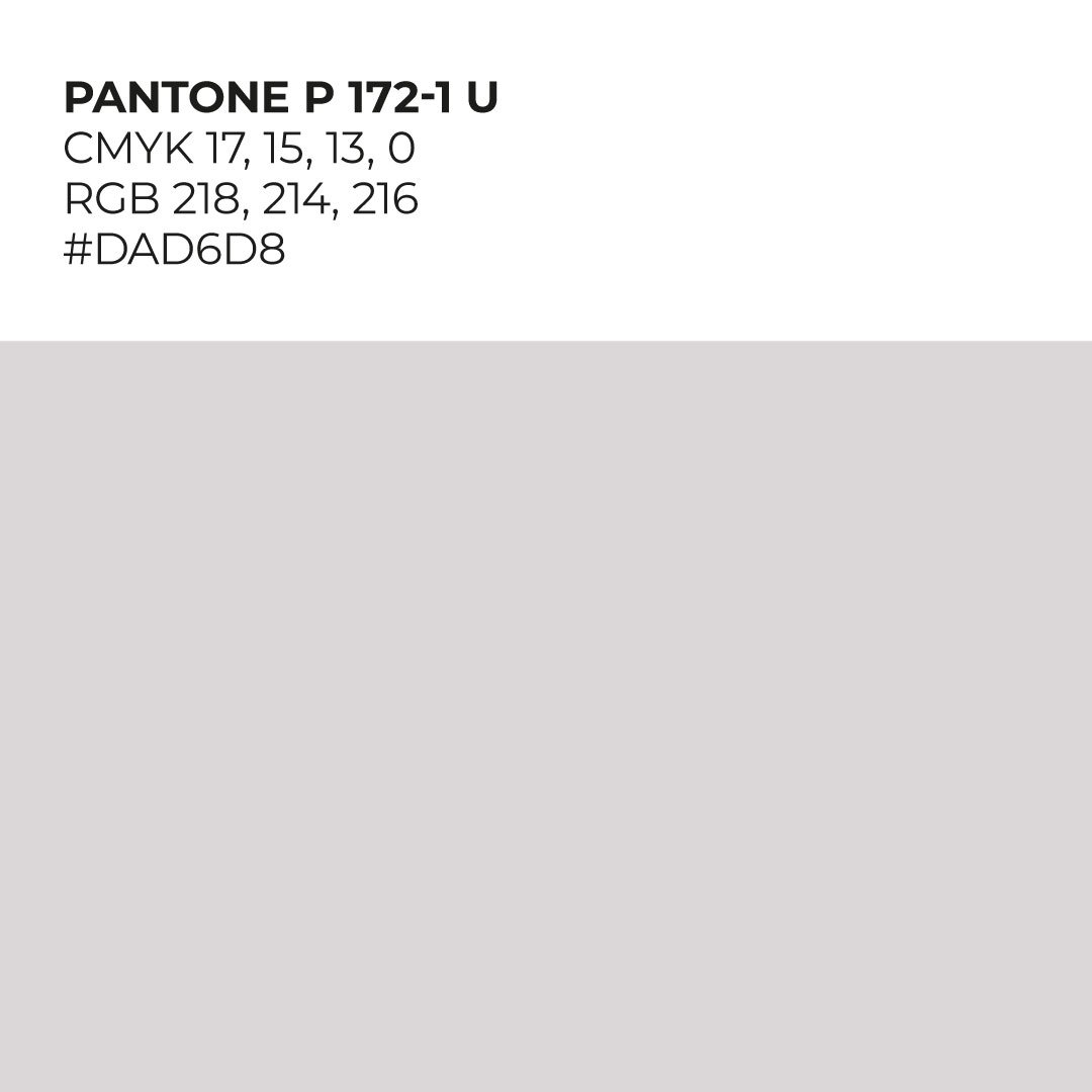

The colour palette
combines black, off-white, blue and orange. The blue and orange subtly reference the three languages Språkrike works between, while balancing the more serious and outgoing sides of the identity.
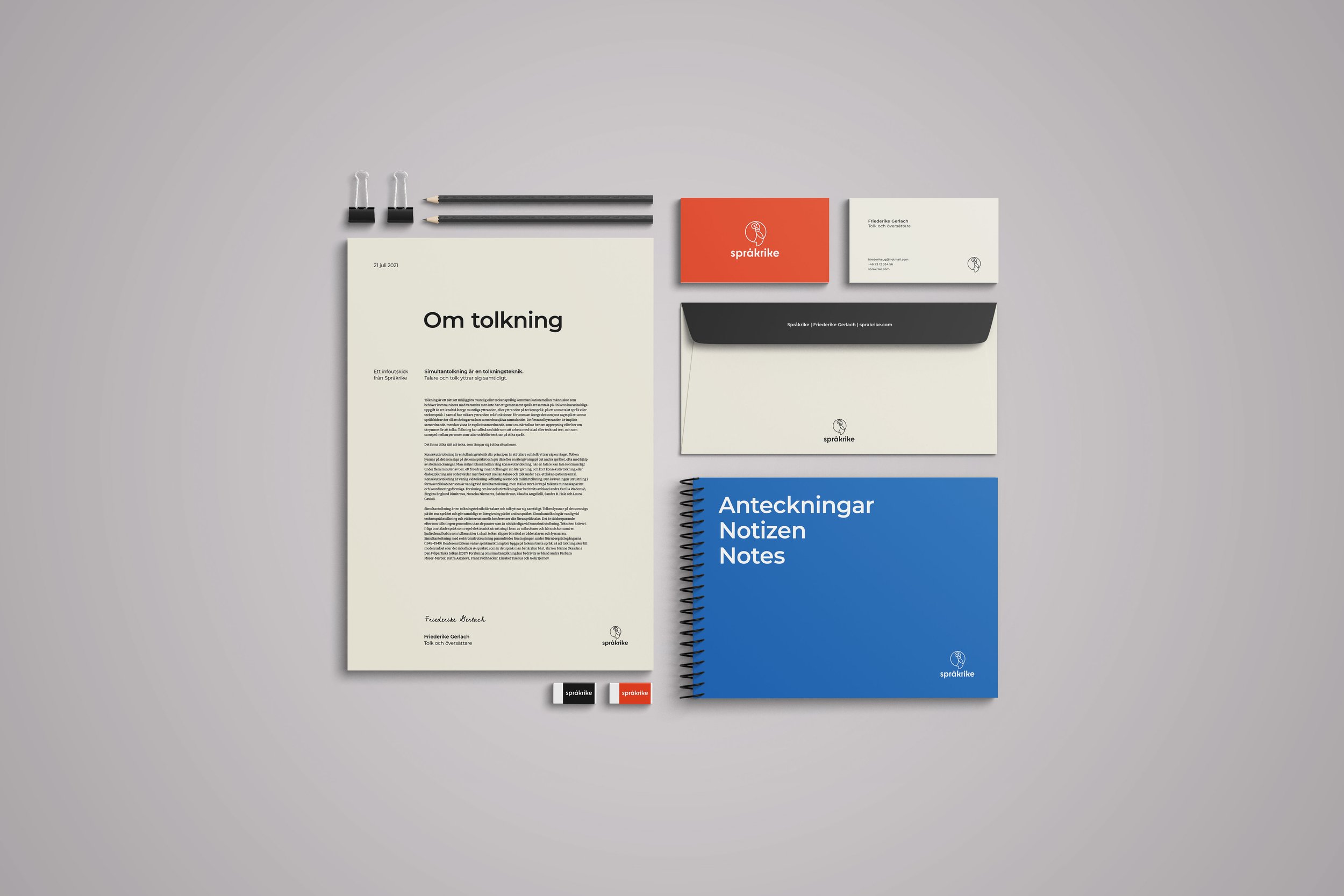
The logo
Combines a parrot with a speech bubble: a playful nod to language, communication and the act of interpreting. The speech bubble is taken directly from the shape of the logo and used as a graphic element, creating a visual connection between the logo and the wider design system.


Example images. From Unsplash.
Imagery
The imagery combines portraits and everyday situations. The aim was to make the identity feel human and approachable, while still professional enough to speak to authorities and organisations. The duotone or black and white treatment acts as a unifying layer, allowing photography with different origins, styles and quality levels to work together as one visual language.